Like many web-designers I've often wished I could assign multiple backgrounds to a single (X)HTML element using CSS to create effects like drop shadows or rounded boxes. But alas CSS1 and 2 only permit each element to have at most one background image.
So far the best way to achieve such effects is to layer elements on top of each other and giving each one part of the combined background. For example, to create a box with rounded corners you could use 4 corner images (one for each corner), create 4 nested elements and assign one of the images as a background in the corresponding corner to each. Unfortunately this approach usually bloats the HTML with superfluous and semantically meaningless elements.
Luckily, the current draft specification for the CSS3 Backgrounds and Borders Module includes support for multiple, layered background images on a single element! But wait! It get's better still: Beginning with version 1.3, Apple's Safari web-browser added support for this feature (See the Safari CSS3 multiple background support announcement). Other browsers now also support CSS3 multiple backgronds: Konqueror >= 3.5, OmniWeb >= 5.5, Nokia's S60 Browser (included in S60 3rd edition and up) and Safari on the Apple iPhone.
When support in Safari was first announced I just had to try this new feature out! I did this by defining a CSS class called box which creates a box with rounded corners and a drop shadow (so that it looks like it's been cut out of the page). It uses 6 backgrounds - one each for the four corners and two more to create drop shadows along the top and left sides. This is the CSS code:
.box{/* * Multiple background magic! * The order in which images are listed also defines * their stacking - earlier images are drawn on top of * later ones. */background-color:#e2e2e2;background-image:url(,"box-tl")url(,"box-tr")url(,"box-bl")url(,"box-br")url(,"box-left")url(;"box-top")background-repeat:no-repeat,no-repeat,no-repeat,no-repeat,repeat-y,repeat-x;background-position:top left,top right,bottom left,bottom right,left,top;/* * Ensure a minimum height and width so that the corner * images never overlap */margin:0 0 1em 0;padding:10px;min-height:16px;min-width:16px; }
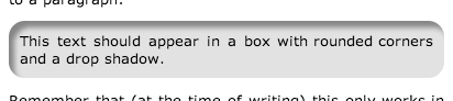
This is the final result when the above class is aplied to a paragraph:
This text should appear in a box with rounded corners and a drop shadow.
Remember that this only works in the browsers mentioned above. In other browsers you will either see the text with no background or just a plain grey background. Here's a screenshot of what it's supposed to look like:
As you can see it works like a charm! Fancy effects like this can now be achieved without sacrificing markup semantics or accessibility and with virtually no page bloat! Big thanks to CSS3 and the browser makers who have implemented this!
As a bonus here's this page as rendered on the S60 browser (using a Nokia N80) and on the iPhone:
![[Screenshot of S60 browser rendering this page]](s60.jpg)
![[Screenshot of Safari on the iPhone rendering this page]](iphone.jpg)
I sincerely hope this feature remains intact in the final CSS3 specification and is quickly implemented in other web-browsers. Mozilla foundation, Opera and Microsoft - I'm looking at you!
Until then here's some more demo pages others have put together to keep you amused:
- Purple picture frame by Dan Bedford
- Mac OS X icons by Chris Clark
- Kaleidoscope Window by Denis Defreyne
- Multiple Backgrounds (CSS3) by Justin Halsall